


Paid advertising can bring more people to your ecommerce store, but it cannot make a confusing or unreliable website convert.
When product information is incomplete, pages load slowly or the checkout creates unnecessary doubt, increasing your Google Ads or Meta Ads budget may simply increase wasted spend. You pay for more visitors, but the same website problems continue to prevent them from buying.
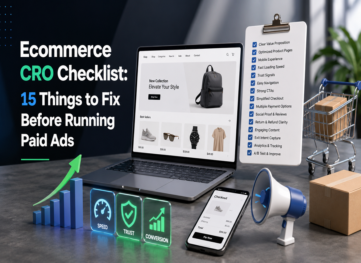
That is why conversion rate optimisation should come before aggressive paid acquisition. This ecommerce CRO checklist covers 15 areas to review before launching or scaling paid campaigns, along with practical ways to identify where your website is losing potential customers.
Why Ecommerce CRO Should Come Before Paid Advertising
Your conversion rate directly influences how much you can afford to pay for a customer.
For example, imagine that 10,000 paid visitors arrive on your website. At a 1% conversion rate, that traffic produces 100 orders. At a 2% conversion rate, the same number of visitors produces 200 orders.
This does not automatically mean your profit doubles. Product margins, average order value, advertising costs and returns still matter. However, it shows how conversion rate improvement can help you generate more value from the traffic you are already paying for.
Ecommerce CRO is not simply about testing button colours. It involves reviewing how customers move from an advert to a landing page, product page, basket and checkout. The goal is to identify uncertainty, technical problems and usability issues that prevent people from completing a purchase.
As experienced ecommerce growth specialists, Cresconnect helps online retailers improve the relationship between website performance, customer experience and paid acquisition.
Review the Complete Ecommerce Sales Funnel
Conversion challenges don’t have to start on the product page either. Users go through several stages before making a purchase:
Advert > Landing page > Product page > Basket > Checkout > Payment confirmation
These steps need to be analyzed individually.
When an advert click leads to quick abandonment of the landing page, the reason could be a poor loading speed, mismatched message or lack of clarity about the offer.
If users look at the products but don’t put anything in their basket, check the product images, pricing, description, reviews and variations.
When users put something into the basket but don’t start the checkout process, it might be because of unexpected delivery charges, confusing discount input fields or a poorly defined return policy.
If the users start the checkout process but don’t pay for the purchase, the problem might stem from mandatory registration, insufficient payment methods or mistakes in forms.
This approach will help the ecommerce brand pinpoint the problem behind poor conversions instead of automatically thinking that it needs more traffic.
Ecommerce CRO Checklist Before Running Paid Ads
1. Confirm That Ecommerce Tracking Is Accurate
Before changing your website or advertising strategy, confirm that your data is reliable.
Review Google Analytics 4, Google Tag Manager, Google Ads conversion tracking and the Meta Pixel. Test important ecommerce events, including:
- Product views
- Add-to-basket actions
- Checkout starts
- Purchases
- Revenue
- Discount usage
Look for missing purchases, duplicated transactions or events firing at the wrong stage.
Inaccurate tracking can make successful campaigns appear unprofitable or poor campaigns look stronger than they are. It also prevents you from identifying where customers are leaving the sales funnel.
Before running ads, complete test purchases on desktop and mobile and compare the results across your ecommerce platform, GA4 and advertising accounts.
2. Improve Website and Page Speed
A paid click has already cost your business money. Do not lose that visitor while oversized images, unnecessary scripts or third-party applications load.
Test your homepage, collection pages, product pages, basket and checkout using PageSpeed Insights. Pay particular attention to mobile performance and Core Web Vitals.
Common causes of poor page speed include:
- Large product images
- Autoplay videos
- Excessive Shopify apps or WordPress plugins
- Unused scripts
- Multiple tracking tags
- Poor-quality hosting
- Heavy pop-ups and animation
Compress images, use appropriate formats and remove applications that no longer support an important business function.
The objective is not to achieve a perfect performance score. It is to make the shopping experience fast, stable and usable across the devices your customers use.
3. Optimise the Mobile Experience
A significant proportion of paid social traffic is likely to arrive on mobile devices. Your store should therefore be designed around how customers browse and buy on smaller screens.
Check whether visitors can:
- Read the main headline without zooming
- Swipe through product images
- Select sizes, colours or variants
- Close pop-ups easily
- Tap buttons without selecting the wrong option
- Complete forms without repeated errors
- Find the add-to-basket button quickly
Use readable text, thumb-friendly buttons, simple menus and well-spaced form fields. A sticky add-to-basket button can also help on long product pages, provided it does not block important content.
Test the full customer journey on real phones rather than relying only on a desktop browser preview.
4. Match the Landing Page to the Advertisement
The landing page should continue the promise made in the advert.
If an advert promotes a specific product, bundle or discount, the customer should immediately see the same product, imagery, price and offer after clicking.
For example, someone clicking an advert for “waterproof walking boots under £80” should not be sent to a general footwear homepage. They should land on a relevant product or collection page featuring suitable boots within the advertised price range.
Review the following elements for consistency:
- Headline
- Product imagery
- Price
- Discount
- Product benefits
- Audience
- Call to action
Strong message matching reassures visitors that they have reached the correct page and reduces the effort required to continue shopping.
5. Clarify the Main Value Proposition
The new visitor should be able to immediately recognize the product and its benefits.
Phrases such as “designed for today’s lifestyle” can create an elegant tone, but will fail to describe the product and its selling points.
One example of how to do this would be:
“Space-efficient furniture made of solid oak wood designed for small British homes.”
This phrase describes the product, materials used, target customer and the benefit of the product.
The value proposition should be placed above the fold, and reinforced by product benefits, images, reviews and other relevant information. Do not require customers to navigate several sections to understand what makes your brand unique.
6. Improve Product Titles, Images and Descriptions
Product pages should answer the questions customers ask before purchasing.
Use accurate product titles, high-quality images, close-up photographs and lifestyle visuals. Add video when customers need to understand fit, movement, texture, scale or product use.
Descriptions should explain both benefits and specifications.
Depending on the product, include:
- Materials or ingredients
- Dimensions
- Fit and sizing
- Compatibility
- Care instructions
- Usage guidance
- Stock status
- Delivery information
- Product guarantees
A furniture customer may need dimensions and assembly information. A skincare customer may need ingredients, suitability and usage instructions. A clothing customer may need fabric, fit, transparency and care details.
A strong product page CRO reduces uncertainty and prevents visitors from leaving the website to search for information elsewhere.
7. Use Customer Questions to Improve Product Pages
Many product descriptions are written from the brand’s perspective. They explain what the business wants to say rather than what the customer needs to know.
Review:
- Customer support conversations
- Live-chat questions
- Product reviews
- Return reasons
- Social media comments
- Internal website searches
Repeated questions often reveal missing product information.
If customers repeatedly ask whether an item is machine washable, suitable for sensitive skin or compatible with a particular device, add the answer to the relevant product page.
This improves the buying experience while reducing repetitive support enquiries.
8. Make Pricing, Offers and Discounts Easy to Understand
Pricing should be transparent throughout the customer journey.
Clearly display:
- Original and sale prices
- Bundle conditions
- Discount requirements
- Subscription terms
- Minimum order values
- VAT information
- Offer expiry dates
- Product or category exclusions
Test every voucher code before launching an advert. The advertised offer should work on the landing page and continue correctly through the basket and checkout.
Avoid hiding important conditions in small print. When customers discover unexpected restrictions after clicking an advert, trust can decline quickly.
9. Display Shipping and Delivery Information Early
Do not wait until the final checkout stage to reveal delivery charges or fulfilment times.
Show relevant information on the product page or near the basket, including:
- Dispatch times
- Estimated delivery dates
- Shipping charges
- Free-delivery thresholds
- Geographic restrictions
- International delivery options
- Tracking availability
Unexpected costs are a common cause of cart abandonment. Even when delivery is not free, early transparency helps customers make an informed decision before investing time in checkout.
10. Strengthen Trust Signals and Social Proof
Customers arriving from paid ads may have no previous relationship with your brand. Your website needs to establish credibility quickly.
Useful trust signals include:
- Genuine customer reviews
- Product ratings
- User-generated content
- Recognisable payment methods
- Secure checkout indicators
- Clear contact details
- Delivery information
- Returns and refund policies
- Guarantees or warranties
- Company details
Product-specific reviews are often more useful than a general testimonial slider because they help shoppers evaluate the exact item they are considering.
Avoid invented scarcity, fake countdown timers or unverifiable claims. These tactics may create urgency, but they can also reduce long-term trust.
11. Make Calls to Action Clear and Consistent
Every page should have an obvious primary action.
On product pages, familiar wording such as “Add to Basket” or “Buy Now” is usually clearer than creative but ambiguous alternatives.
Make sure the call to action:
- Is visually prominent
- Remains visible after variant selection
- Works correctly on mobile
- Provides clear feedback after being clicked
- Does not compete with several equally prominent buttons
Unavailable products or variants should produce a helpful message rather than a silent error.
Multiple competing actions can create decision friction. The customer should always understand what to do next.
12. Simplify Navigation and Product Discovery
Paid visitors may not purchase the first product they view. They may compare options, explore alternatives or look for a different size, price or style.
Help them continue by providing:
- Clear categories
- Useful filters
- Predictive search
- Relevant sorting options
- Breadcrumbs
- Product recommendations
- Recently viewed items
Remove dead ends caused by broken links, empty collections, out-of-stock products or irrelevant suggestions.
The website should make exploration easy without forcing the customer to restart their journey.
13. Reduce Basket Friction
The basket should confirm what the customer selected and help them move confidently towards checkout.
Clearly display:
- Product name and image
- Selected size, colour or variant
- Quantity
- Price
- Delivery information
- Estimated total
Allow customers to update quantities or remove products easily.
Avoid aggressive upsells, confusing discount fields and compulsory account creation at this stage. A prominent voucher field can even encourage customers without a code to leave the website and search for one.
Keep the basket focused on completing the intended purchase.
14. Simplify and Optimise the Checkout
Checkout friction can undermine an otherwise strong ecommerce sales funnel.
Offer guest checkout and remove unnecessary form fields. Use clear error messages, address autocomplete and mobile-friendly inputs where possible.
Review whether your audience expects payment options such as:
- Debit and credit cards
- PayPal
- Apple Pay
- Google Pay
- Shop Pay
- Buy now, pay later services
- Relevant local payment methods
Express payment options can reduce effort, particularly for mobile customers. However, they should be tested carefully to ensure shipping, discounts and conversion tracking continue to work.
Run test transactions across multiple devices and payment methods before launching a major campaign.
15. Make Returns, Refunds and Support Easy to Find
Customers are more comfortable purchasing when they understand what happens if the product is unsuitable.
Explain:
- Return windows
- Refund timelines
- Exchange options
- Return costs
- Product exclusions
- Contact methods
- Customer support response times
Use plain language instead of complex legal wording.
For higher-consideration purchases, clear FAQs, order tracking and accessible pre-purchase support can make the brand feel more dependable.
Analyse User Behaviour Before Scaling Ads
Once the essential customer journey is working, use ecommerce analytics and behaviour tools to understand where friction remains.
Platforms such as GA4, Shopify Analytics, Microsoft Clarity and Hotjar can help you review:
- Conversion rate by device
- Conversion rate by channel
- Add-to-basket rate
- Checkout initiation rate
- Checkout completion rate
- Exit pages
- Internal search queries
- Scroll depth
- Heatmaps
- Session recordings
Look for repeated patterns. One session recording may be an isolated incident, but several customers struggling with the same size selector or payment form suggest a genuine usability problem.
Combine behavioural evidence with customer feedback and quantitative data before making major website changes.
Build Dedicated Landing Pages for Paid Campaigns
Not every advertising campaign should send visitors to an existing homepage or category page.
A dedicated landing page may be more effective when a campaign focuses on a specific audience, benefit, product bundle or seasonal offer.
For example, an advert promoting a skincare bundle for dry skin should lead to a page centred on that concern. Sending the visitor to a general skincare category containing dozens of unrelated products creates unnecessary decision-making.
A strong ecommerce landing page should include:
- A headline that matches the advert
- The main product or offer above the fold
- Relevant product benefits
- Strong product imagery
- Reviews or social proof
- Delivery and returns information
- Frequently asked questions
- One prominent call to action
Avoid excessive navigation, competing offers and unrelated promotional banners. The page should guide the visitor towards one clear next step.
Common CRO Mistakes Ecommerce Brands Make
Making Changes Based on Opinion
A founder or designer may prefer a particular layout, but customer behaviour may reveal that important information is difficult to find.
Use evidence rather than personal preference wherever possible.
Focusing Only on the Homepage
Paid traffic often lands directly on product, collection or campaign pages. These pages may have a greater influence on advertising performance than the homepage.
Optimising Only for Desktop
A page can look polished on a laptop and remain frustrating on a mobile phone. Always test the customer journey on the devices producing the majority of your traffic.
Changing Too Many Elements at Once
When several major changes are implemented together, it becomes difficult to understand which one influenced performance.
Prioritise meaningful issues and measure changes carefully.
Treating CRO as a One-Time Project
Customer expectations, devices, traffic sources and product ranges change. Conversion rate optimisation should continue after the initial website improvements are completed.
Create a Pre-Advertising CRO Testing Plan
Start by recording current ecommerce performance, including:
- Conversion rate
- Add-to-basket rate
- Checkout initiation rate
- Checkout completion rate
- Average order value
- Cart abandonment rate
- Conversion rate by device
- Conversion rate by traffic source
Then use a structured process:
- Identify the problem.
- Review the supporting evidence.
- Create a clear hypothesis.
- Implement one meaningful change.
- Measure the effect.
- Keep, refine or reverse the change.
For example:
Problem: Mobile visitors view products but rarely add them to the basket.
Evidence: Session recordings show customers repeatedly scrolling between the size selector, product details and purchase button.
Hypothesis: A clearer size selector and sticky add-to-basket button will make the purchasing action easier to complete.
Not every improvement requires a formal A/B test, especially on lower-traffic websites. However, important changes should still be documented and evaluated against previous performance.
How to Prioritise the Ecommerce CRO Checklist
Do not begin with cosmetic design changes simply because they are easy.
Prioritise:
- Broken analytics, forms or payment systems
- Mobile usability and page speed
- Product information and offer clarity
- Basket and checkout friction
- Navigation and visual improvements
Consider how many users encounter the issue, where it occurs in the funnel and how much revenue it may affect.
A payment failure affecting 5% of customers is likely to be more commercially important than a minor spacing issue on the homepage.
Know When Your Ecommerce Store Is Ready for Paid Ads
Your website does not need to be perfect before advertising begins. However, the essential buying journey should be functional, understandable and measurable.
Your store is more prepared for paid traffic when:
- Ecommerce tracking has been tested
- Important pages load reliably
- The mobile journey is usable
- Advertising messages match landing pages
- Product pages answer common questions
- Pricing and delivery charges are transparent
- Trust signals are visible
- Basket and checkout work correctly
- Popular payment methods are available
- Returns and support information are easy to find
- Your team can analyse behaviour after launch
Paid advertising can also generate valuable CRO data. The goal is not to postpone every campaign indefinitely. It is to avoid scaling spend before the website can provide a credible and convenient buying experience.
How Ecommerce CRO Supports Better Ad ROI
CRO does not guarantee a specific improvement because results vary by product, market, price, traffic quality and customer intent.
However, a faster and clearer ecommerce experience gives paid visitors a better chance of converting.
Effective ecommerce CRO can help you:
- Generate more sales from existing traffic
- Reduce avoidable funnel drop-off
- Improve acquisition efficiency
- Make landing pages more relevant
- Produce cleaner performance data
- Scale campaigns from a stronger foundation
Paid media and CRO teams should analyse the complete journey together. A low conversion rate may be caused by the website, but it may also be influenced by poor targeting, weak creative, an unattractive offer or low customer intent.
CRO Should Continue After Campaign Launch
Completing a website optimisation checklist for paid ads is only the beginning.
Once campaigns are live, compare performance across:
- Google Ads and Meta Ads
- Organic search and email
- New and returning visitors
- Mobile and desktop users
- Products and collections
- Landing pages
- Geographic locations
- Campaign offers
Different audiences may behave differently even when they visit the same page.
Review paid media data alongside website behaviour. When advertising and CRO insights are analysed separately, teams may optimise the wrong stage of the funnel.
Final Ecommerce CRO Checklist Before Launching Ads
Before increasing your advertising budget, confirm that:
- Tracking is accurate
- Pages load quickly
- The mobile experience is usable
- Advert messaging matches the landing page
- The value proposition is clear
- Product pages answer buying questions
- Pricing and offers are transparent
- Shipping information is visible
- Trust signals are credible
- Calls to action are obvious
- Navigation supports product discovery
- The basket is simple
- Checkout is easy to complete
- Returns and support information are accessible
- Customer behaviour is being analysed
Conclusion
Paid ads amplify the ecommerce experience behind them.
If that experience is slow, unclear or difficult to trust, additional traffic may simply create more revenue leakage. A well-optimised website gives your campaigns a stronger opportunity to convert visitors into customers.
Use this ecommerce CRO checklist before paid ads to fix the fundamentals, validate the customer journey and make more informed decisions before increasing spend.
For professional support identifying the product page, ecommerce UX and checkout issues affecting your performance, explore Cresconnect’s ecommerce CRO services.
FAQs
- What Is an Ecommerce CRO Checklist?
A: An ecommerce CRO checklist reviews the website elements that influence whether visitors complete a purchase. It typically covers analytics, page speed, mobile usability, product pages, trust signals, navigation, basket design, checkout and post-purchase policies.
- Should I Optimise My Ecommerce Website Before Running Paid Ads?
A: Yes. Website optimisation before ads helps remove avoidable friction and ensures that tracking, landing pages and checkout work correctly. Your website does not need to be perfect, but the main customer journey should be reliable before you scale paid traffic.
- What Should I Fix Before Launching Google or Meta Ads?
A: Prioritise conversion tracking, mobile performance, page speed, landing-page relevance, product information, pricing, delivery details, trust signals and checkout usability. Technical problems and purchase barriers should be fixed before cosmetic design changes.
- How Can Ecommerce CRO Improve Paid-Ad ROI?
A: Ecommerce CRO can improve the percentage of paid visitors who complete a purchase. This may generate more revenue from the same traffic and improve customer acquisition efficiency. Results still depend on product demand, audience quality, pricing and campaign strategy.
- What Product Page Fixes Matter Most Before Running Ads?
A: Start with clear product images, useful descriptions, accurate pricing, simple variant selection, delivery information, returns details, genuine reviews and a prominent add-to-basket button. The page should answer the customer’s main purchase questions without requiring additional research.
- How Can I Reduce Cart Abandonment Before Scaling Ads?
A: Show shipping costs early, simplify the basket and checkout, offer guest purchasing, support relevant payment methods and clearly explain delivery and returns. Use analytics and session recordings to identify the exact stage where customers abandon their purchases.